Monday, August 28, 2006

An Edward Gorey Animation!?


I read this this article Derek Lamb (a wellknown 1970's animator) wrote about meeting with Edward Gorey. They wanted to work with Edward Gorey in desinging the opening titles to "Mystery" a PBS program.

"Gorey had arrived at the meeting with a fully scripted idea for the title sequence, an intriguing concept using a Victorian children's puppet theater. Unfortunately the script timed-out at twenty minutes in length. Joan needed a mere 40 seconds. An impasse already."

Although they ended up having to re-design the title sequence on their own after reviewing Gorey's ideas and books, I so wish I could watch his actual original 20 min version!

Here's a few peices of art he created for the his original 20 min script.


And here is the final product for PBS's progam "Mystery" title sequence


Sunday, August 13, 2006

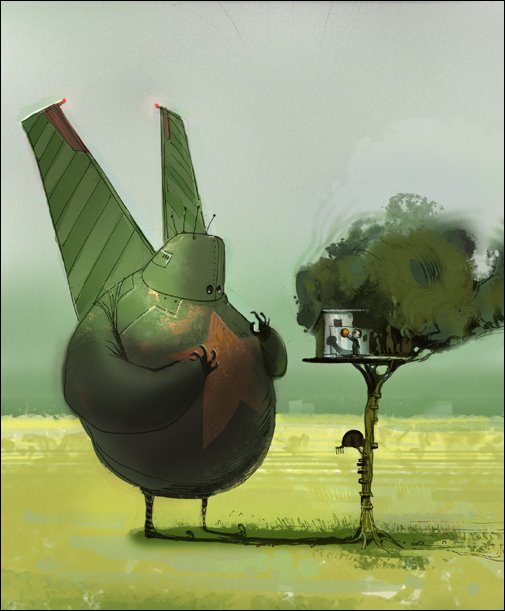
Chris Appelhans: of Froghat Studios


Amazing in all styles, his simple cartoon stetches, his classical paintings, realistic or non, he's staggering. Check out all of his portfolio, he's incredibly versatile. He did a lot of conceptaul illustrations for the movie Monster House. Which I recommend, it was an entertaining film, scarey, funny, different, and visually remarkable. Defiantly not just another animated Pixar type movie.

link Froghat Studios


Saturday, August 12, 2006

istoica everyday


I was never really into portrait photography, until I came across the creative genius of the folks at istoica everyday.

Tuesday, August 01, 2006

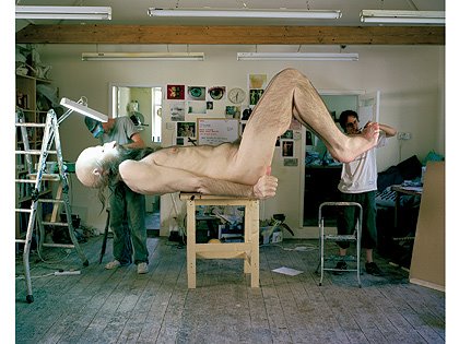
Uncomfortably Realistic: Ron Mueck


Ron Mueck's disturbingly hyper-real sculptures are finally being brought together in a long-overdue show in Edinburgh.

Article link

click the "In pictures: in the studio with Ron Mueck" link at the top of the article to see a slide show of him working on his stuff. Pretty wild.

Sunday, July 02, 2006

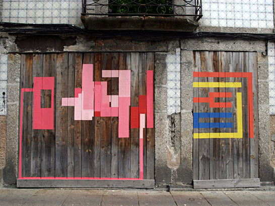
Eltono & Nuria


Eltono & Nuria are Spanish artists that do incredibly simple yet detailed and smart line designs. The colouring is usually bright and lovely and the placement of the exterior pieces always give off an unobtrusive, yet concentrated 'fit.' The patterns only slightly deviate in style and form, staying relatively consistent, but always look new and refreshing in each piece. I'm thoroughly impressed by the the subtlety and design of their work and the 'canvas' use that compliments rather than distracts, making for an appropriateness that many artists lack in their street applications.
Easily one of my favorite artists right now. I've put a new emphasis on pattern-making lately because of these two. http://www.eltono.com/

Sunday, June 25, 2006

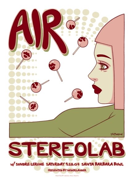
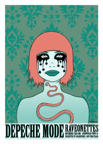
Visual Music: Tara McPherson


Surely a girl of many talents, Tara creates everything from DC and Vertigo Comicbook covers, to designing illustrations for Spin Magazine and she sports a huge list of rad bands she's done poster work for. Scope her sight for more info. link. She's going to be at the San Diego Comic-Con 2006 and so will I, so maybe I'll meet her in person and buy a print or two if my wallet allows.

Tuesday, June 13, 2006

Photographer Jan Von Holleben


Check out the dreams of flight set.
From his site:

"After a spell as a photographer’s apprentice and as a director at Young Photographers United, Jan von Holleben moved permanently from Germany and signed up to study for a BA Hons in Photography at the prominent SIAD University in the South of England. Following his graduation, Jan has gone onto achieve a great deal in very short space of time. Based in London, he founded the non-profit organisation for emerging photographers photodebut (www.photodebut.org) in 2003 and has since worked as freelance photographer, picture editor and director of photography in London commissioning
international photo-shoots.
His personal work has been showcased in leading titles such as Creative Review, the Face, Sleazenation, The Independent and various others. He has won a number of photography awards in the UK including an Observer Hodge Photographic Award, a Lucie Award in NY and most recently an Audi-Next Level Photographic Award"

Link.

Sunday, June 04, 2006

ITALIAN BLU


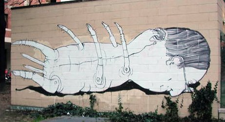
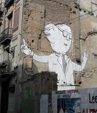
This guy could possibly be my new favorite modern artist.

He is AMAZING! His stuff for some reason appeals to me in everyway. Its simple yet skilled very line drawings. Its all 100% his own style. Completley original, (The only influence I could note would be maybe David Shrigley, but thats even a stretch) He's taken his abilities to every level, from simple sketches drawings and illustrations, to large scale murals on the sides of buildings, to super creative animations, and even T-shirts. He's not coating his style or content with over used urban trendy motifs. I actually know very little about him, let me kow if you find out his full name, or more of his work online. I've just been exposed to his website, but its packed with interesting creations. Scope out every branch of his site, its all good. His sketchbook, Drawings, Walls, and Videos. I especially liked his video FFWD


THORAX CLOTHING


I've been designing a few T-shirts, basically to try my hand at desiging a clothing/sales website. Let me know if you like the look of the site and the T-shirts, I have a few samples of the site up on my portfolio.
link

Friday, June 02, 2006

Daily Dose of Imagery


I'm sure some of you may be familiar with this site already. The Daily Dose of Imagery is a photo site by Sam Javanrouh. He takes his camera around with him and gets one shot a day of his surroundings then posts it to his blog. He has won over 10 awards for his blog and just as many honorable mentions. I love the composition and the saturated colors in his work. Matt's right! All the talent is in Canada!

Link.